Mobile App Revamp
From webview to native: Rebuilding respond.io's mobile app
Company: respond.io — a B2B SaaS customer communication platform
Role: Product Manager & UX Design Lead
Overview
Respond.io's previous mobile app was a webview wrapper, that is the web app loaded inside a mobile shell. It was the fastest way to ship mobile, but it had a limit: 2-star reviews, long load times, poor UI/UX, and users who couldn't rely on the app to do their job.
This project replaced it with a native app, scoped to the use case that mattered most: agents responding to customer conversations on the go.
The Problem
FullStory data showed the Contact page averaging 32 seconds to first contentful paint on mobile, while the Messages module — the most visited page — averaged 15 seconds. Users were staring at blank screens waiting for content that should have been instant.
Canny and app store reviews told the same story:
- "It takes too long to load the statistics and messages."
- "I waited 60 minutes and the app still didn't open."
- "Notifications don't work"
- The Apple Store rating sat at 2.3 out of 5.
Pendo analytics confirmed that 93.2% of mobile page views were in the Messages module. Users had one job on mobile, and the app couldn't reliably support it.
My Role
I defined the product scope, led all UX decisions, wrote the full specification, and drove alignment across mobile development, QA, and stakeholders. This included deciding what not to build, which is as consequential as what we shipped.
Design Process
Stakeholder interviews & data review
I started by reviewing FullStory performance data, Pendo usage analytics, and app store reviews alongside feedback from the CS and sales teams. The usage data made the scoping decision straightforward: 93% of sessions were in Messages, which meant the first release needed to do that one thing exceptionally well.
Competitor research
I reviewed the mobile apps of Sleekflow, Front, Trengo, Intercom, and WATI. A notable finding: none of them allowed account creation on mobile. All assumed an existing user signing in. This validated our decision to exclude sign-up from scope and design specifically for the returning agent use case.
User journey & flow
I mapped the core agent journey: receive a push notification, open the app, read context, reply. Every screen and interaction was evaluated against that flow. If it didn't serve that journey, it was deprioritised.
Low-fidelity wireframes
I produced annotated wireframes covering the full Messages module, Notification Centre, and Settings.
UI collaboration
I stayed closely involved through final design, reviewing iterations to ensure the UX logic held as visual decisions were made. The UI team handled the visual execution, while my role was to keep the experience anchored to the agent use case.
Strategic Decisions
Scope the app to the main pages, and ship it faster
The existing app had six modules. We could have rebuild the new mobile app with everything, but I pushed for a different frame: what does a field agent actually need on their phone? The data gave a clear answer — Messages, Notifications, and basic Profile Settings. Shipping a focused, fast messaging app was more valuable than shipping a slow everything app.
We kept the old app available for users who needed those modules and planned expansion in phases based on post-launch feedback.
Design for the agent, not the manager
Rather than replicating the desktop experience on a smaller screen, we designed for an agent moving between notifications and replies on the go for their daily work.
- The contact list defaulted to Open conversations sorted by Newest Message.
- Swipe gestures surfaced the two most common actions (Close and Snooze) without navigating into the conversation.
Fix frictions causing real harm
One of the most-upvoted Canny requests was about the Enter key sending messages instead of creating a line break. Agents were accidentally spamming customers. We fixed this in the native composer, defaulting to line-break behaviour with a dedicated send button.
Rebuild notifications from the ground up
Unreliable push notifications were the second most common complaint after load speed. We rebuilt notification delivery natively with granular user controls: sound settings, and push notification scope (all contacts / assigned only / mentions only).
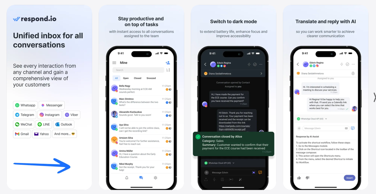
The Solution
A native iOS and Android app across three modules:
Messages:
- Contact list with inbox filtering (Standard / Team / Custom inboxes)
- Full conversation view
- Native composer supporting file upload, voice recording, snippets, variables, and message templates
- Conversation actions accessible via swipe and ellipsis menu
- Contact details
Notification Centre
- New / Archived / All tabs. Swipe to archive
- Unread count badge on tab icon
Settings
- Profile editing
- Security
- Status toggle (Online / Busy)
- Notification preferences
- Workspace switcher
- Logout.
Sign-up was deliberately excluded. The target user was an existing agent, not an org creator.
Instrumentation & Impact
What we set up to measure:
- App store rating — The clearest public baseline
For qualitative feedback, we integrated Instabug for in-app bug reporting. Bug submissions created conversations were triaged by the CS team and escalated to QA, with a Slack alert firing on every new submission. This closed the feedback loop in a way the old app never had.
Qualitative outcomes at launch:
- Agents reported being able to rely on push notifications for the first time
- The CS and sales teams used the new app as a credible response to app store criticism that had been a recurring objection in support and sales calls.
- The QA team had a structured feedback pipeline rather than scattered reviews to work from
- Internal teams were aligned on a phased roadmap. The scoping decision reframed the mobile app as an ongoing product, not a one-time fix.