Onboarding improvement
Redesigning respond.io's first impression during onboarding
Company: respond.io, a B2B SaaS customer communication platform used by B2c businesses for sales.
Role: Product Manager & UX design lead
Completed in: 2024
Overview
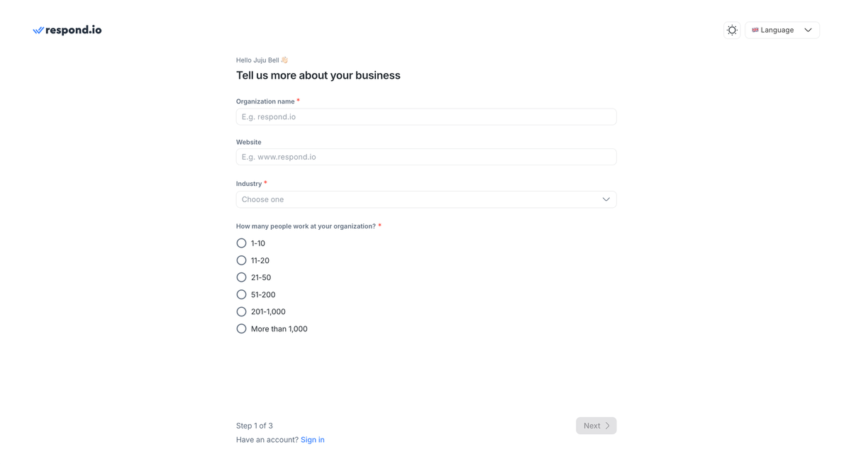
Respond.io's onboarding flow asked new users five questions, then dropped them on a blank dashboard. It collected data nobody acted on and sent users toward a first action nobody guided them to.
This project redesigned the onboarding experience from the ground up — sharpening what we asked, why we asked it, and where we took users next.
The Problem
The data collected wasn't usable
The original flow asked for organisation name, website, phone number, company size, and which team would use the platform. None gave the Sales, Growth, or the Product team enough signal to do anything differentiated with it. We knew someone from a company signed up. We didn't know their role, their industry, their use case, or which channels they needed.
The result: Generic onboarding emails, untargeted sales outreach, and in-app guides that couldn't adapt to the user in front of them.
Users weren't seeing value fast enough
After submitting the form, users landed on the dashboard with no obvious next step. The intended action (connecting a messaging channel) was buried in Workspace Settings. Most users didn't find it quickly. The gap between completing onboarding and experiencing the product's value was too wide.
In the end, the whole onboarding flow was an activation problem.
My Role
I owned this from end-to-end: Problem definition, stakeholder alignment, interaction design, content, requirements, and collaboration with sales, growth, design and development teams.
Design process
Stakeholder interviews
I spoke with the Sales, BDR, and Growth teams before design. Sales couldn't prioritise leads without knowing who they were talking to. Growth had no way to segment new signups, so everyone received the same generic email chain regardless of use case.
Competitor research
I reviewed the design and onboarding flows of Sleekflow, Front, Trengo, and WATI. The pattern was consistent: Flows split questions across multiple focused steps and some led with relevant social proof.
User journey & flow
I mapped the end-to-end journey from sign-up to first meaningful action — connecting a channel. This made the activation gap obvious. The original flow ended at the dashboard with no forward momentum. The new journey had one clear exit point: the Channels page.
Mid-fidelity wireframes
I produced annotated wireframes covering both steps, including social proof placement. Annotations were written for both the UI team and engineering.
UI collaboration
I stayed closely involved through final design, reviewing iterations to ensure design intent carried through. The UI team enhanced the visual quality, while my role was to keep the functional decisions according to the research.
Strategic Decisions
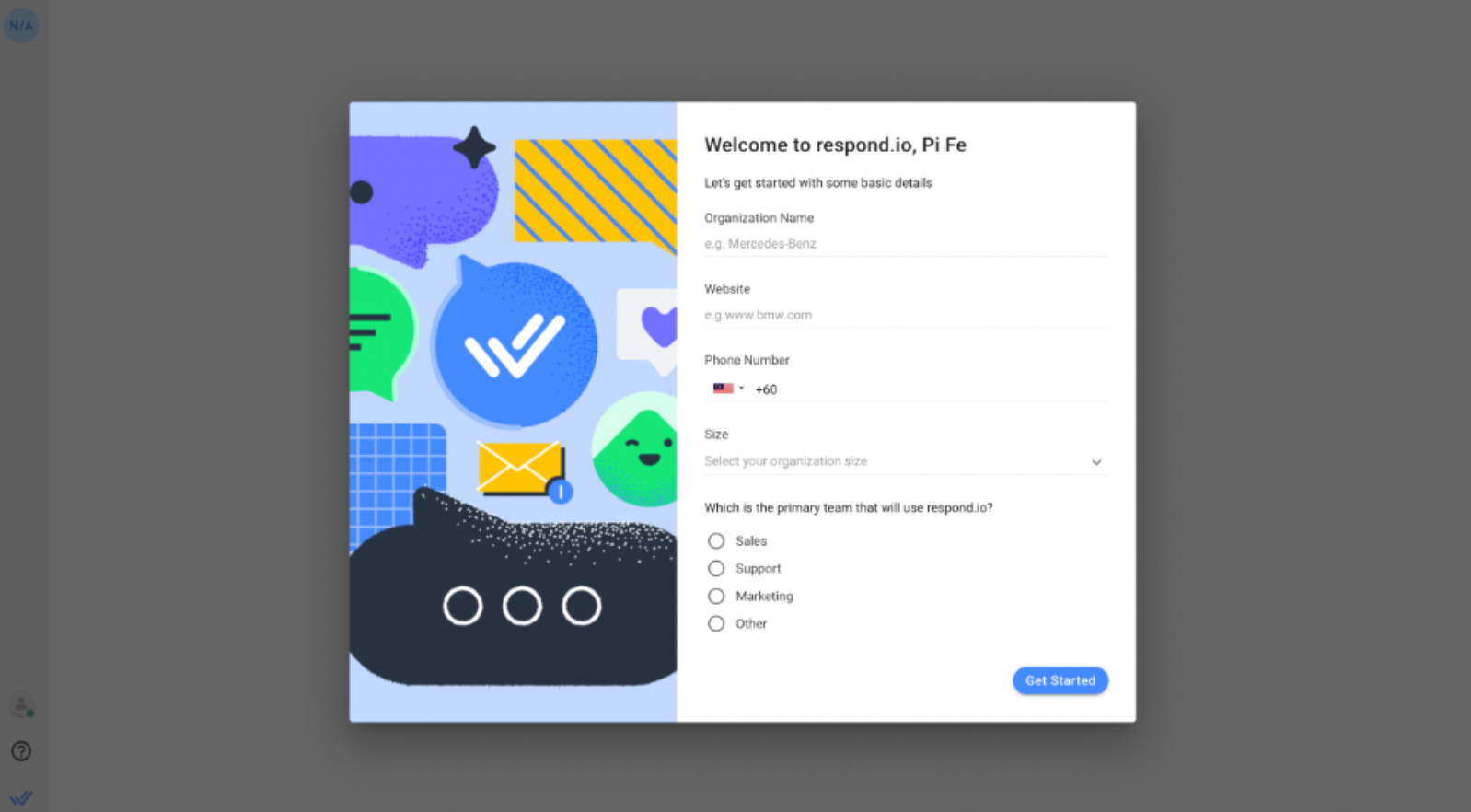
Ask fewer, sharper questions across two focused steps
I restructured the flow into two full-screen steps with a clear purpose: Step 1 to understand the organisation and Step 2 to understand the use case.
Replace "which team?" with purpose + channel
The old primary team question (Sales / Support / Marketing / Other) produced segments too broad to act on. I replaced it with:
- Primary purpose: Handle inbound conversations / Send promotional campaigns / Click-to-chat ads / WhatsApp Business multiple users / WhatsApp broadcast / Other. This gave Growth a input for segmented email sequences and gave Sales a lead intent signal from day one.
- Primary channels: Multi-select, up to three, from the platform's actual channel list with matching icons. This enabled Pendo to serve channel-specific setup guides. For example, a user who selected WhatsApp got a WhatsApp guide.
Add role and industry for lead quality
I added two mandatory fields:
- Industry (single-select with an "Other" fallback)
- Role (Owner / Director / Manager / Individual Contributor).
These directly addressed a gap the Sales and BD teams had flagged, that is they couldn't prioritise leads without knowing who they were talking to.
Show social proof that's actually relevant
The redesign moved to a full-screen two-panel layout:
- Form on the right, social proof on the left.
- Step 1 showed global brand logos and customer quotes.
- Step 2 showed region-personalized logos based on the user's IP address, falling back to global defaults when no regional match existed.
I chose static over carousel. Static quotes are read easily. Carousels are skipped.
Change where onboarding ends
The highest-leverage change cost the least to implement: redirecting users to the Channels page after completing onboarding, instead of the dashboard.
The user had just told us which channels they wanted to use. The logical next action was connecting one. Routing them to the page directly removed 2-3 navigation steps and turned onboarding completion into the start of activation, rather than a handoff to nowhere.
The Solution
Step 1 — Organisation Setup
- Full-screen layout.
- Organisation name, website, phone, size — carried over from the original.
- Industry and role added as mandatory fields with "Other" text fallbacks.
- Social proof: global brand logos and two customer quotes.
Step 2 — Use Case Profiling
- Primary channel selection (multi-select, up to 3) and primary purpose (single-select).
- Social proof updated to region-personalised logos and quotes.
- Back / Get Started CTAs. All fields mandatory with inline validation.
Post-completion redirect: Channels page under Workspace Settings.
Instrumentation & Impact
What we set up to measure:
- Onboarding completion rate per step – Identify where drop-off occurred and which fields created friction
- Channel connection rate — The activation metric that the redirect change was designed to move
- New Segment.com traits (industry, role, primary purpose, primary channels) flowing into Growth's email sequences and Sales' lead scoring from day one of the new flow
All onboarding responses were enriched with Clearbit Reveal data – company geography, size, industry, and tech stack — giving every new signup a richer profile than the old flow could produce.
Qualitative outcomes at launch:
- Sales and BDR teams gained actionable lead data from signup for the first time. Role and purpose replaced the ambiguity of "which team uses this"
- Growth could build segmented onboarding sequences by channel and use case, rather than sending the same email to every new user.
- The Channels-page redirect received positive feedback from the CS team, who had repeated support queries from users who couldn't find where to connect a channel.