Lessons from building my first app
Tiny takeaways building VSJO — a visual gratitude journaling app
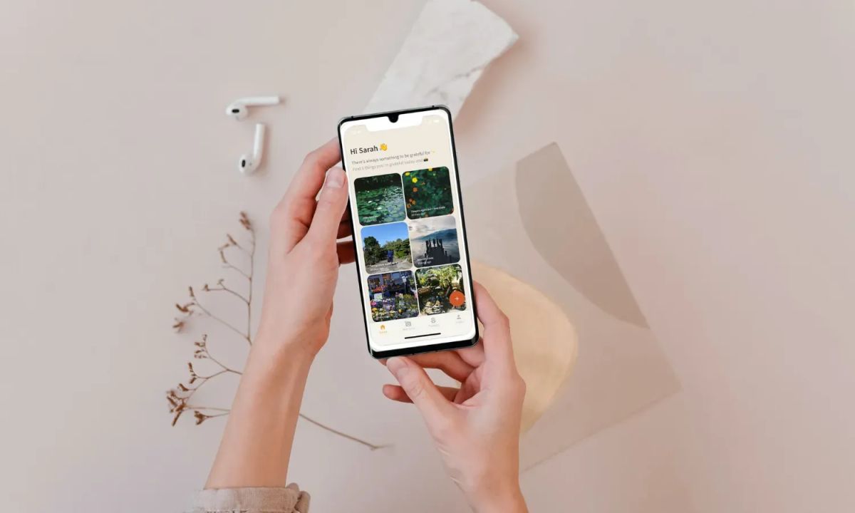
I built a tiny app in May, and I launched it to the early sign-ups in June. I recently relaunched again to allow people to sign up immediately to try.
If you haven't heard already, I built VSJO — what I'd like to call a visual gratitude journaling app. I built it using Adalo, a no-code tool.
Different people have different ways to express themselves. Some people might have trouble expressing themselves through words, so why not take a photo of what you're grateful for instead? There are already a ton of journaling apps out there, but I wanted to make something dead simple so they don't have to worry about other features. VSJO is for first-timers planning to build a journaling habit.
I took some notes about the lessons I learned while building this tiny app, and want to share them with you readers.
Here are some tiny lessons from building my tiny visual gratitude journaling app:
1. Get your landing page up first
You're still working on your product. Your friends want to check it out, but you tell them you don't have anything yet. Wait until I get the product up, you say. Stop right there.
Even if you don't have all the details ready, what you can already do is set up a mini landing page first with the possibility to sign up. At least you can already start directing people to the page. It doesn't need to have everything. Tease them with a preview of what's coming.

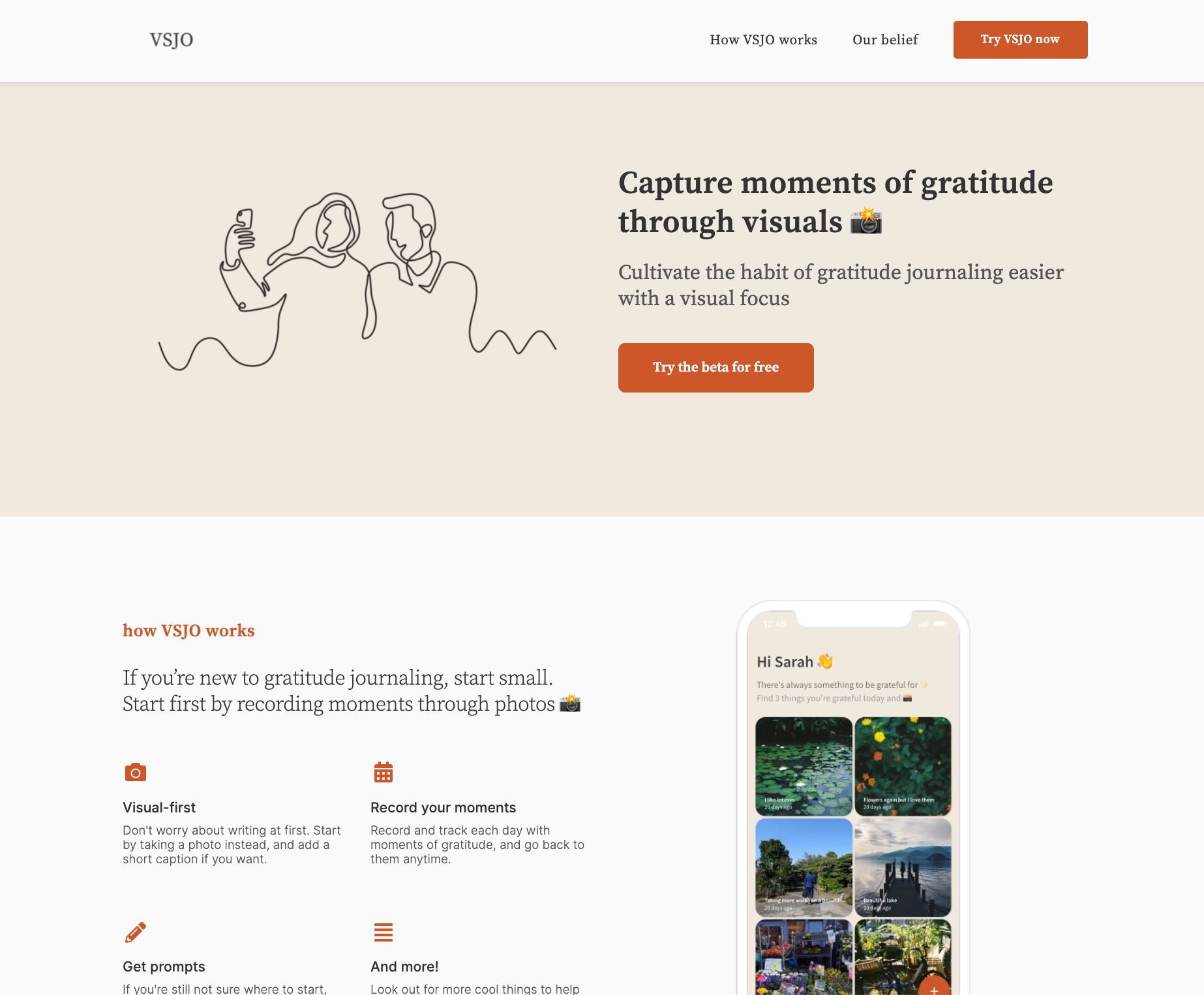
My first mini landing page - a preview of what's coming
The best part? You can always come back and make changes to your landing page at any time. I've gone through 4 changes since May.
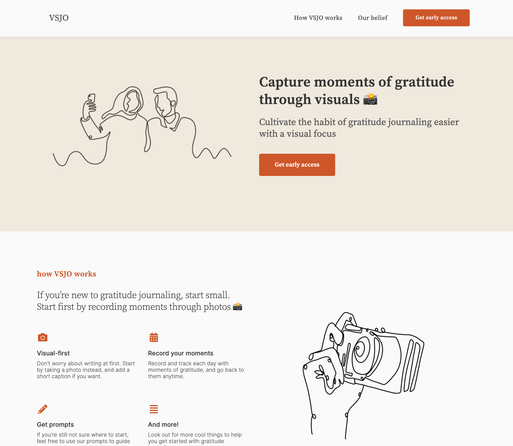
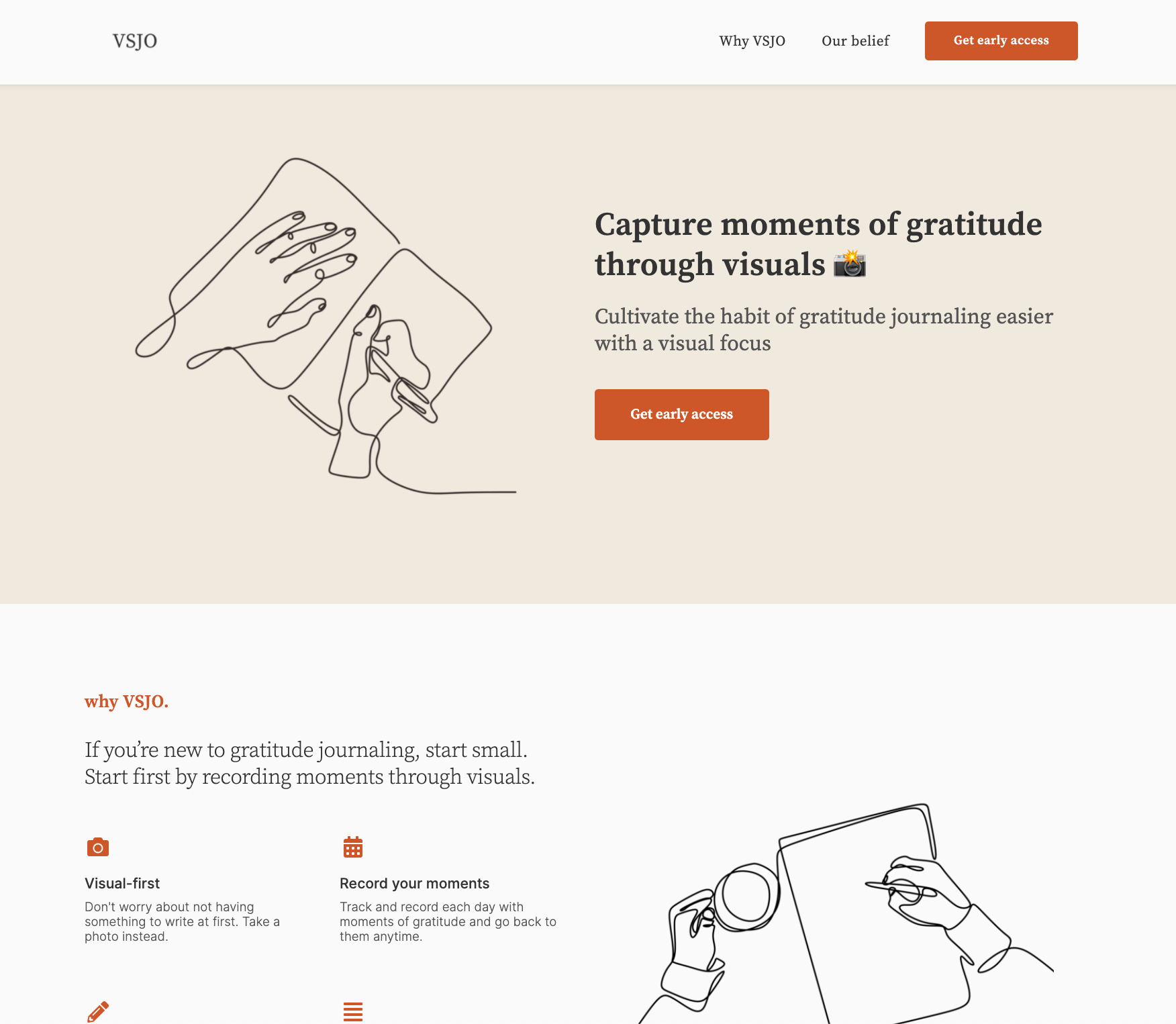

Even though they are small tweaks to the illustrations, they make a big difference. Once you get your product up, it'll be good to show a mockup of it as a preview for people to see.
Why do these small tweaks matter? This brings me to the next point
2. The first impression of your landing page is important
I made some changes to my landing page to correct a mistake after some feedback — compare V1 to V2. It looks a bit better in V2 and more in line with what I have in mind for VSJO. However, V2 can definitely still be improved which is what I did later in V3 by adding a mockup.
Why is first impression important? What went wrong for me?
After the launch, I assumed everything was fine and dandy. I could focus on building the actual product. People were signing up for the app. Things were great. That is until I received some comments from a few people who were excited to try drawing on the app.
...Drawing?
Your landing page will tell your visitors everything they need to know about your product. Despite the mentions of taking photos (as a visual focus) in the copy of the landing page, people are more drawn (lol) to the visuals first before anything else. Just like social media posts, we notice the image first before the captions.
In my case, I used this line-art illustration style solely for aesthetic purposes. However, since they appear like doodles along with the use of paper and pen illustrations, it gives off the impression that drawing is involved.
One of the quickest ways you can do to avoid this is to ask for feedback from your friends. Even though your friends might not be your target audience, they can still give you initial thoughts about your page. Of course, better yet, ask the people who have signed up for your product.
There was initially this nagging feeling at the back of my head that feels like something isn't right. Try to address that feeling if you have any. Maybe it might be something you're missing.
Big thanks to @ningxxu and @fraserdeans for bringing this up, and also big thanks to @thearslankhalid for sharing suggestions to make it clearer.
3. Figuring out the colour palette
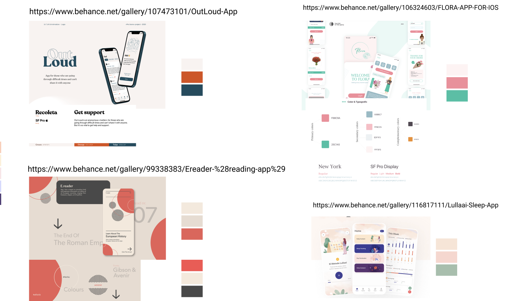
In the initial stages of research, I just couldn't figure out the colours I wanted for VSJO.
I can't remember how I arrived at this solution, but here's how I found mine:
- Browsed through design inspiration websites like Behance and Dribbble
- Looked for some designs that caught my attention
- Took screenshots of them for my Figma file
- Identify the primary and secondary colours of the designs
- Got inspiration from here and there too, including looking for specific colour palettes e.g. brown or autumn-looking palettes. You can try places like Pinterest or Instahues.
- Arrived at my chosen palette!
4. Don't let your waiting list wait
I got my landing page up and tweeted about it on Twitter. There was some engagement going around, and people started signing up. However, I let the people on my waiting list wait. I didn't send them any welcome, confirmation or thank you emails after they signed up.
Don't be like me. I wished I could have at least thanked them.
I only managed to do that right before the day I was supposed to launch.
If you want to do more with your waiting list, Aprilynne summed up 5 other ways you can do:
- User interviews: Send an email with the option for a user interview. Don't let this opportunity slip to talk to your users who signed up
- Pre-sale: While your users wait, you can always start to sell your product before it's ready.
- Newsletter: Update your users with weekly progress about your product.
- Gamification: The more your users do certain activities (tweet about your product, for example), the sooner they can get access to your product.
- Giveaways: Keep your product at the top of your users' minds by doing weekly giveaways.
More in her thread:
I let my startup's waiting list of over 150 people waste away
— Aprilynne Alter (@AprilynneAlter) May 27, 2021
Don't repeat my mistake
Here are 5 ways to use/engage your product's waiting list BEFORE your product is ready 👇
5. Prep your launch before the actual launch
This felt like a rookie mistake.
I thought I had everything in my head and I could do the launch on the day itself.
What happened on my side: I didn't have a huge launch for VSJO for the early access signups, so that was why I wasn't too worried. However, on the day I wanted to publish the app, I couldn't. There was an error with the subdomain I planned to use on Adalo. Needless to say, that issue persisted for a few days until I used a workaround (i.e. using my own subdomain).
No matter how experienced or how small your product is, prep your launch and make sure you have everything you need.
Even better, launch your product first before the actual launch. No one would know the link to your product, so it's fine. I should have done that in the beginning.
6. When in doubt, make a list
It might come pretty obvious to some people, but when I first started building VSJO, I thought I had everything in my head.
A simple thing that helped was a list. I broke the tasks down into different checklists: research, building, and release. They were rough but they got me through.
Make lists that you can check off. It's so simple, but it really helped keep me in check and make sure I have everything before the launch.
Make sure to create a release checklist too. I did, but I should have been a bit more thorough.
7. When in doubt, ask
You might have years of experience, but there will be different sets of challenges you may face. So don't be afraid to reach out for help, no matter what stage you are on your journey.
I was talking to one of my friends, Shaf, and casually brought up the problem I had. And she suggested a workaround that I had not thought of before, even though it was plain in sight.
Even when bouncing ideas and problems off of each other, you might be able to easily find your solution there and then. So don't be afraid to ask for help. (I'm still trying to be better at it)
8. Remember the big picture
Sometimes I get too absorbed with the details. You might too.
My example is a little smaller. I had a problem with building one of the features. I wasn't able to figure out how to add a favourite button on the screen. Whenever I tested it out, it didn't appear. But when I took a step back, I figured out I needed to add it inside of the existing form block.
Take a step back if you feel lost. If we look at a much bigger picture (is this meta or what), we should always keep in mind the main purpose of the product you're building. Most features are probably nice to have, but chances are they don't serve a bigger purpose for your product just yet.
Other highlights
Stats time:
- Early access sign-ups: 50, but only around 25% actually signed up to use the app
- Open beta launch: 10 signups
- 30-day active users: 13 users. Daily active users: None 🙈
Next steps:
- I want to talk to the people who signed up and request feedback. So far the feedback I've been getting is nice, but not constructive enough 🤔
- However, in the next month or two, I might decide to put the app on hold if I can't find a way to support VSJO which is currently free right now. Adalo is expensive, but thankfully I have a pretty big discount from On Deck. Let's see.
✨ Give VSJO some love ✨
Twitter: @tryVSJO
Site: vsjo.xyz (Update: Discontinued :'))
VSJO is free to use: Support the project


